
Best Colors for Small Kitchens That Feel Bigger
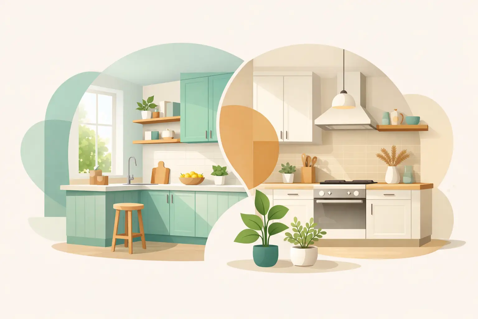
A small kitchen does not need a major addition to feel more open. The right paint, cabinet, and flooring colors can change how the room reflects light and how separate surfaces relate to one another. The best colors for small kitchens are usually not about choosing plain white by default. They are about creating a clear, connected finish plan that makes the room feel brighter, cleaner, and less crowded.
For homeowners planning a kitchen refresh or full remodel, color decisions should be made alongside cabinets, drywall repairs, countertops, backsplash, flooring, and lighting. A wall color can look very different once warm cabinet wood, dark appliances, or patterned flooring are in place.
Start With Light, Not Just a Paint Chip
Natural light, window direction, ceiling fixtures, and under-cabinet lighting all affect how color appears. A shade that looks crisp in a paint store can appear gray, yellow, or dull in a kitchen with limited daylight. Before selecting final colors, test sample boards on more than one wall and look at them morning, afternoon, and evening.
In many Florida homes, strong daylight can handle softer warm whites, pale blues, light greens, and light greiges without making the room feel dim. In a kitchen with few windows, lighter colors with a moderate light-reflectance value usually do more work. They bounce available light around the room instead of absorbing it.
This does not mean every surface must be white. A kitchen with white walls, white cabinets, white counters, and cool white lighting can feel flat or clinical. The goal is contrast with control: enough difference between materials to create definition, but not so much that the kitchen breaks into small visual sections.
Best Colors for Small Kitchens by Surface
Warm white for walls and ceilings
Warm white is one of the most dependable choices for compact kitchens because it reflects light while avoiding the harsh look some bright whites create. Look for whites with subtle cream, beige, or soft gray undertones. These work especially well with wood-look laminate flooring, beige countertops, brushed nickel hardware, and stainless steel appliances.
Using the same or a closely related white on walls and ceilings can make the ceiling line less noticeable. That visual continuity can help a low kitchen feel taller. If the cabinetry is already white, choose a wall color that is slightly warmer or deeper so the cabinets do not disappear against the wall.
Soft greige for a practical neutral
Greige combines gray and beige, giving homeowners a flexible neutral that works with many existing finishes. A light greige can make a small kitchen feel current without committing to a cool gray color that may look cold under certain lighting.
This is a useful option when a remodel includes medium-tone flooring, stone-look counters, or cabinets in white, taupe, or light wood. The key is to keep the greige light. Dark greige can look refined in a large kitchen but may make a tight layout feel boxed in.
Pale blue for a clean, open feel
A muted blue with gray or green undertones can give a small kitchen a fresh appearance without overpowering it. Pale blue works well in kitchens with white or light gray cabinets and good natural light. It can also balance warm-toned wood floors and creamy counters.
Avoid saturated navy or bright turquoise on every wall in a small kitchen. Those colors can be effective as an accent, but they usually reduce the sense of space when used across the entire room. If a homeowner wants blue cabinetry, a soft blue-gray lower cabinet paired with light upper cabinets is generally easier to live with than dark blue cabinets throughout.
Light sage or gray-green for warmth
Soft sage and gray-green colors bring in a natural look while staying calm enough for a kitchen. They pair well with white cabinets, warm brass or black hardware, light oak finishes, and neutral tile. For a small kitchen, choose a faded, low-saturation green rather than a strong olive or forest green.
Green can be a good choice when the kitchen has limited architectural character and needs a little personality. It still should be balanced by light countertops, a simple backsplash, and bright task lighting. Too many competing finishes can make a small room feel busy, even when the paint color itself is light.
Light wood and creamy cabinet colors
Cabinet color often has a bigger visual impact than wall color because cabinets cover so much surface area. White, off-white, light taupe, and natural light wood are reliable cabinet choices for smaller kitchens. They reflect more light and reduce visual weight at eye level.
Creamy cabinets can soften a kitchen with warm flooring or beige tile, while a light wood cabinet finish adds warmth without the heaviness of dark espresso cabinets. If upper cabinets are being replaced, keeping them lighter than the base cabinets is one of the simplest ways to make the kitchen feel less top-heavy.
Use Dark Colors Carefully, Not Fearfully
Dark colors are not automatically wrong in a small kitchen. They can add depth, hide everyday wear on lower cabinets, and create a more tailored look. The issue is placement.
A dark color works best when it is limited to one grounded surface, such as lower cabinets, an island base, a backsplash accent, or a single wall. Pair it with light upper cabinets, pale walls, reflective counters, and adequate lighting. This keeps the darker finish from closing in the room.
For example, deep charcoal lower cabinets can work with warm white walls and light quartz counters. Navy can work on an island in an otherwise light kitchen. Black hardware can provide contrast without covering a large area. When cabinets, walls, floors, and counters are all dark, a small kitchen can feel noticeably tighter.
Coordinate Color With Flooring and Countertops
A kitchen color plan is more successful when the floor and counter are treated as major color surfaces, not afterthoughts. Dark, heavily patterned floors can visually shrink a narrow kitchen, particularly when paired with dark cabinets. Lighter laminate flooring in a consistent wood tone or subtle stone look usually helps the room read as one continuous space.
The same principle applies to countertops. Light counters with gentle movement are often easier in small kitchens than busy patterns with sharp contrast. A quiet white, cream, or light gray counter can reflect light and give painted cabinets room to stand out.
If existing counters or floors must stay, use them as the starting point. Identify whether their undertone is warm, cool, or neutral, then select wall and cabinet colors that support it. A cool gray wall beside a yellow-beige countertop often looks accidental, even if both colors looked good separately.
Keep the Backsplash Simple and Connected
A backsplash is a chance to add texture, but it should not compete with every other finish. In a small kitchen, extending a light backsplash from the counter to the upper cabinets can create a cleaner vertical line. White or warm neutral tile is practical, easy to coordinate, and unlikely to limit future updates.
For a more customized result, a backsplash can be slightly darker than the counter but lighter than the lower cabinets. This creates a gradual shift between surfaces instead of abrupt contrast. If the kitchen has patterned counters, keep the backsplash plain. If the counters are simple, a modest tile texture can add interest without clutter.
Avoid Common Small-Kitchen Color Mistakes
The most common problem is choosing each finish separately. A homeowner may select a favorite wall color, cabinet sample, floor plank, and backsplash tile without seeing them together. Once installed, the undertones can clash and make the room feel less finished.
Another mistake is using too many accent colors. In a compact kitchen, cabinet color, wall color, backsplash, counters, flooring, and hardware are all visible at once. Limit the main palette to two or three connected colors, then add small accents through stools, towels, window treatments, or décor that can be changed easily.
Finally, do not overlook the ceiling, trim, and drywall condition. Cracked corners, uneven texture, stains, or poorly patched walls can distract from even a well-chosen color plan. Proper drywall repair, surface preparation, priming, and professional painting create the clean lines that make light colors look their best.
Choose a Color Plan That Fits the Work Ahead
If the project is a paint refresh, a light warm white or soft greige may provide the strongest return with the least disruption. If cabinets are being updated, consider a two-tone plan with lighter uppers and a restrained darker base. For a larger remodel, coordinate the cabinet, wall, counter, backsplash, and flooring samples before installation begins.
AP Interior Solutions can help homeowners plan and complete the practical parts of that work, including cabinetry, drywall finishing, interior painting, and laminate flooring installation. Handling connected trades through one remodeling team helps keep the final colors and finishes working together.
The best choice is the one that suits the kitchen's light, existing materials, and how the household uses the space. Start with a light, coordinated foundation, then add depth where it will be seen and appreciated rather than where it will make the room feel smaller.
Planning a project in South Florida?
AP Interior Solutions remodels kitchens and bathrooms and delivers flawless painting and drywall across Broward, Miami-Dade and Palm Beach. Free in-home estimates, English y español.